Is your kids bedroom decoration boring? Do you feel like giving it a new air for this spring-summer? The change of season is ideal to do so, so today we will discover what are the most inspiring colors of this season and give you a hand to decide which ones best fit your tastes - and those of your children.
From sweet bets based on dusty and soft tones to more risky proposals in black and white, beautiful classic combinations that we had forgotten, or serene natural environments. We are going to propose different designs and how to apply them in a children's bedroom through textiles, vinyls, toys ...
The style of the moment has its own palette: Natural

A very effective way to apply a decorative trend in your home is through color. The different shades and color contrasts will provide the look wanted. If you have decided on a Neorrustic children's bedroom, the first thing we will do is play with contrasts.
The palette of the Natural or Neorrustic style is inspired by nature, and its star colors are neutral tones, specifically those creams, grays and countless earth, with a touch of black.

We will apply them by covering the floors of natural wood or microcement, painting a wall in gray or covering it with wooden slats, although another option is to resort to slate walls and finally we will place white muslin in windows and some magic corner.
It is necessary with so many dark colors to add contrast through light-colored furniture, such as white, cream, gray and soft earth. The pine wood and plant fiber accessories, like carpets and baskets, they can provide these earth tones that we are looking for. And as icing, add a bright green touch to give life to the room. For this you can use plants, toys or some original cushion.
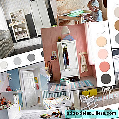
Potpourri of powdered tones: mint, peach ...

We go from an austere combination to the most colorful palette. It is, in addition and without a doubt, the most complex of all, so we must be prudent, and not go over. For starters, and the most important thing in this color scheme, is that all the tones must be pastel and dusty at the same time.
That is, when we refer to pastel tones, it is that they are simply the lightest tones of the range, and when we talk about dusty, it is that to these colors a touch of white or gray is added, with which, the tones are more nuanced and not so alive, thus achieving a more harmonious palette.

Use combinations of three or four colors. The kings are mint, peach, pink and blue. Mix them on the wall, as we see in the picture, in the lingerie of the home, in some accessory and in the toys. We can leave most of the walls and furniture in white or light gray, so that the environment does not recharge.
Nordic bedrooms with a natural and bright color scheme

The colors of the Nordic style evolve and pass from a total look white to a more sixties style in which include a lot of natural wood and some touch of bright color like yellow or green.
White or cream shares prominence with light earth tones, to be more exact with pine wood, transforming, in this way, into a more natural and relaxed color scheme. One way to achieve this environment is to accompany the wood with white tones on walls, furniture and floors.

It is important to mix different textures to give more life to such a monochromatic palette. Use textured textiles, the wood itself, a wicker chair, teddy bears, wool rugs with long hair ...
A third color that appears on this palette is gray, a light gray that adds sweetness to the environment. You can apply it through a closet, a carpet, toys or household linen.

And if what you want is to give that air of the sixties, then it is best to line a wall with a giant black and white photo of a landscape and add some Mid-Century design piece in green or bright red.
A sweet combination: pink, salmon and gold

This is, of all the color combinations that we will talk about today, the most feminine and romantic. Composed of shades of salmon, pink, with small touches of gold or mustard and gray, on a base in raw colors, all of them in a powdered pastel range.
We will apply the most colorful colors with discretion in accessories, household linen and toys (pink and salmon) and the most neutral colors (white and raw) more abundantly and as a base, on the walls, floor and furniture.
And finally we will add small touches of gold or mustard to add shine and touches of gray to get some contrast, and thus prevent the decoration from becoming cloying. For this use accessories such as garlands, stuffed animals, sheets, photo frames, decorative boxes ...

Monochromatic palette: White and gray or black

Neutral tones and simple palettes are all the rage, we increasingly see how decorating publishers are more sober and discreet. With them we managed to create calm, harmonious and well-being environments.
The maxim of this trend is to decorate the bedroom in black and white or, if you find it too aggressive, in white and gray, both are tremendously creative combinations and although it seems that it will be limited, it has a lot of possibilities.

Forget about the disgusted idea that black is not a childish color. Any color - used with moderation - is suitable for a child, you should simply create an imaginative space where your child feels at ease. For this we must feed on many black and white graphic prints or gray, applied in textiles and wallpaper.
If you dare, paint a wall in black and leave the rest in white, although if you prefer a look sweeter, it is best to opt for a wall or a mole gray weir. Line some of the remaining walls with some rhombus patterned wall paper in gray tones, and finish the space with toys, drawings, cushions and textiles in black and white.

In black and white tones we finish this collection of ideas full of color in which, in short, the protagonists are discretion, neutral, dusty and natural tones. As a last tip when applying color, remember the maximum of 'less is more'. Do not risk getting tired of your decoration ahead of time, you can always add more color if you see that that point is missing.