Christmas arrives and with it the congratulations of all kinds. There are those who make calendars, there are those who send videos, there are those who send virtual postcards and some people prefer to hand in a postcard.
For those who want to make a personalized greeting With the photo of your children in an economical way (they can be done in the digital development stores, but you will always have to pay) I bring you a step-by-step tutorial.
The program used is known Adobe Photoshop, although there are others that can also serve. Once we have the image we can send it by e-mail, print it, write it back and deliver it by hand, take the image to a specialized store to make us hand calendars, etc. To start we will download the font (typeface) we want, basically to make a different congratulation and avoid the typical fonts that we all know.
You can download hundreds of fonts from Fontcubes. The one that I have used is the “Kingthings Christmas” that you can download here and if you put “Christmas” in the search engine you will see all those that have Christmas motifs.
Once downloaded, unzip the "rar" in the folder we want and copy the resulting file into the Windows / Fonts folder to install.
Then we open the Photoshop and the image Here you can see the work desk of the program:

To start we will introduce the text we want. I guess it will be "Merry Christmas" or similar, so I keep this one.
For this we activate the text tool, which is the "T" that you can find in the tools.

Now we choose at the top the font that we have downloaded. In my case, as I have said, it is the "Kingthings Christmas".

We write the text and choose the right size. We can leave all the letters black, or blank, or use colors. I find it more fun in full color, so, one by one, we put the color we want.

Once all the colors are put on, such a thing remains.

Now we are going to give the image a more Christmas look by putting a blurred white border (something like snow-fogged crystals in winter).
To do this we go to the "Layer" menu, which is at the top and select "New layer / Ok". Once this is done we will see, in the Layers window (lower right corner) that we have three layers, the Background, which is the image we have opened, the Text, and the layer we just created. Select the new layer to be active:

We choose the brush tool (red square) and choose a brush with gradient (the point that looks blurred) with a large size to paint almost with the edge of the brush. It's a good idea maximize the image to allow you to paint from outside of the photo (if it is not maximized, the brush changes to arrow when leaving the window).

In the following image you can see how the maximized image looks and what size I have chosen for the brush (circle in the upper left corner).

We started painting the edge of the image white. Once painted everything will look something like this:

If you notice the letters with the white have been erased. Well, they really haven't been deleted, but have been hidden behind the target. To see them again in all their splendor we must move the text layer up so that it is above the white layer. We click on the Text layer (the mouse hand takes the form of being holding the layer) and we move it up.
Now the letters are seen again and the border whitens the image (look at the position of the layers in the red box):

If you consider that you have bleached the edge too much, you can always touch up by modifying the “Opacity” of the layer. To do this you can choose the opacity percentage in the layers window. By default all layers are completely opaque (100%), so you just have to lower the value a bit to make them more transparent.

Now we are going to touch up the lyrics a little, which look a little bland. In the layers window, we click with the right button on the text layer and choose the option “Merge options”. A window like the following will open:

It's time to play a little with the options. The only thing I will put is a “parallel shadow”, whose options (size, distance, origin, opacity, etc.) you can modify clicking about "Parallel shadow" and an "Inner glow", which gives a bit of light to the letters, although there are many other options that you might like, such as the outline, the inner shadow, which gives more light to the inside of the letters, etc.

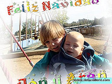
Finally I add the names of my children at the bottom of the image. The final result is what you can see heading this entry. To play!
PS: At the end we give “File / Save as…” and choose the jpg extension to save the image joining all the layers. You can also save at any time as "psd", which is the editing file that retains all layers and modifications to continue editing.